
Data modeling is so pervasive in our daily lives that we often don’t even notice that changes are being made to the underlying data. But today, you can enhance your data and prepare it for analysis with the assistance of Data modeling in SAP Analytics Cloud easily. You can also edit your data in bulk, define categories and hierarchies, and create your own formulas.
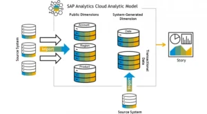
SAP SAC data models fulfill these needs by providing data in a more “usable” form. The simplest way to think of these models is as the framework into which the data is loaded through a data connection (with reference to the framework structure or formats) and then “optimized” or transformed state for use in the various reporting and analytical capabilities of SAP SAC.
This also explains why the data model is so important. Simply put, you can’t produce anything without a data model, whether it’s a story, an application, or a digital boardroom that isn’t directly tied to the data source. Therefore, data modeling and data model development are essential for the use and development of present and future reports. SAC Planning can assist the process seamlessly.
Source: https://blogs.sap.com/
In SAP Analytics Cloud, there are two main business intelligence functions:
- Models
- Stories
Models are where you perform all of your data modeling prior to analyzing it. Data modeling involves data wrangling or cleaning, defining your measure and dimension, and enriching your data by creating hierarchies, specifying units and currencies, and adding formulas to your data.
Stories, however, bring your data to life. In Story mode, your data can be visualized using charts and graphs. This gives you a whole new way to view your data and get valuable insights about your business.
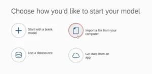
After you click Create > Model in the menu, you will be prompted to link your data. In this case, we will import the file from our desktop.
Source: https://blogs.sap.com/
You can also skip data modeling entirely and jump straight into Story mode. However, there are some advantages to taking a few minutes in Modeler. For example, if you want to quickly visualize your data in a chart, you may want to jump straight to Story mode.
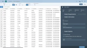
On the other hand, when you begin in the “Modeler view,” you can take your stories to the next level with the help of data modeling. After you’ve entered Modeler, you’ll see the following screen:
Source: https://blogs.sap.com/
The Modeler shows data in the form of rows, columns, and tabs. It also has various tools to help you convert your data.
Let’s learn the basics of Data Modeling:
Data Wrangling
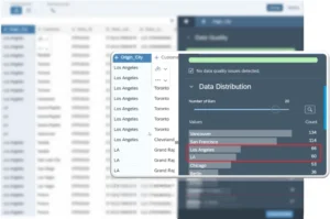
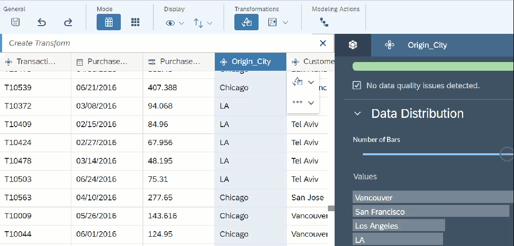
We often find inaccuracies in the data we capture. For example, your dates may not be in the correct format, or there may be typos, etc. Before you start your analysis, make sure your data is organized correctly. For example, in the example below we have the location spelled in two different ways, i.e., ‘LA’ and ‘Los Angeles’. Obviously, we will need to correct this. We can easily fix this using Find and Replace.
Source: https://blogs.sap.com/
In the above example, we have found all instances of ‘LA’ and replaced it with ‘Los Angeles’. However, since ‘Los Angeles’ has been treated as a standalone location, changing its name will not bring it together with the existing ‘Los Angeles’ data. To do this, we have to merge the ‘Los Angeles’ and ‘Los Angeles’ sets. We can choose any instance of ‘Los Angeles’, click transform, and merge it with the ‘Other Los Angeles’ data.
Source: https://blogs.sap.com/
Next,
We have the city and state categories. We want to divide this into two columns. We can easily do this using the splitting function.
Choose the column that you want to separate and click on the split option. You can create new columns by separating them with spaces, dashes, commas, etc. You can also combine two columns.

Source: https://blogs.sap.com/
In Units and Currency, you can specify the type of value you want to display and the units you want to display them in. You can choose from the following options:
- Blank: No unit will be shown
- Label: You can specify a text label (up to 30 characters long) that you can use to define your display units. You can use it as a measure or as a packaging unit (e.g., ‘bottles’).
- %: The percentage option shows the percentage of the value after the value.
- Currency: This option applies to all monetary values.
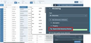
Hierarchy
Hierarchy can be used to create parent-child relationships in your data. For instance, let’s say you have sales information for:
- Global
- Country
- State / Province
- City
Source: https://blogs.sap.com/
In Story mode, you’ll be able to drill down into your enriched charts. See how to do this in action in our post on Hierarchies.
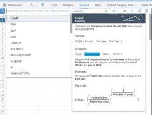
Formula
You can also use formulas to create new measures. These are easy to use and will save you a lot of time in your story. For instance, in our example dataset, we have 2 measures: the original sales price and the discount. We can use a formula to create a new measure called ‘Revenue’.
Source: https://blogs.sap.com/
Data modeling in SAP Analytics Cloud (SAC) is highly valuable and plays a crucial role in the effectiveness of data analysis and reporting.